

Thriveology
Conceptual Redesign
Overview
Individual Project
My Role: UX/UI Designer, UX Researcher
Tools: Sketch, WordPress
Timeline: Ongoing
Background
Thriveology is a small business in Denver that specializes in Holistic Medicine as well as a special form of Chiropractic Medicine called Network Spinal Analysis. The company has been doing business for over a decade, but their company website has not been updated to support the growth and changes of their business. Their specialty of chiropractic study is not well known in the public, and therefore it needed some general information describing services offered. Because Thriveology is a small business, owners do not have access to web developers nor understand how to utilize front end development, which makes it very difficult to update a website. I was given the opportunity to redesign the company website and give them guidance on how to upkeep the design after it had been finished. Although the website had only minor and mid-level usability issues, the site did not provide a lot of information about services or functionality (such as scheduling appointments) . I focused on the desktop version of the provider portal as it had the most usage.
The Goal
While I could have created an original design in sketch, it wouldn’t be feasible to create a design they would not be able to be easily utilized and would need a developer to create. Since the business owners were not familiar with how to develop a website nor did they want to pay an expensive bill for something they would have to upkeep more regularly, it made the most sense to use a website building platform. I chose a template from WordPress and designed what the screens would look like in sketch so they would be able to see what the finished product would look like. I also wanted to change the general focus of the site from business centered to user centered.
Research
Heuristic Evaluation
After studying the existing website, I found mostly minor and mid level usability issues, nothing severe or critical. The site had a focus on making their business known and trusted, but there was very little mention of what their services actually were, making the user have to go to dig for the information instead of it being readily available. There was also a very heavy focus on social media (where there were at least 4-5 of the same icons on one page) , media presence and reviews. Services offered were not explained as to what they were, making the business even more ambiguous as to what they actually do.
The goal of the website became very simple after the evaluation; make the website focused on the user and the services that the user can be provided.
Competitive Analysis
There were not a lot of Chiropractic offices that offered Network Spinal Analysis, making it difficult to obtain a large data set of competitors. However, the ones that I was able to find had some marked advantages over the Thriveology website that made them far more user centric. I evaluated both chiropractic and holistic medicine businesses for this competitive analysis.
Thriveology was compared against the following competitors:
Form Medical
Denver Holistic Medicine
The Point Accupuncture and Holistic Medicine
Colorado Health and Wellness Center
Wellness Rhythms and Gentle Chiropractic Care
Ideate
Thriveology is a very small practice of 3 doctors, a registered nurse and 3 administrative assistants. Their office is open throughout the majority of the week, taking clients throughout the day for both holistic medicine and chiropractic services. Clients often change their appointments, which can make it difficult to maintain a set schedule. Some of the objectives that were explored were:
Education of new patients to unknown services
Ways of making the website more user-centric
Potential solutions for alleviating administrative duties
Consolidation and organization of general information to make it easier to find
Ways of automating metrics (e.g. daily patient headcount, etc.)
Onboarding methods for new patients
Design
Mockups
It was important to communicate peace, friendliness and health through this design. I kept the logo and main color throughout the design but added a lot of visuals that speak to the businesses services and general feel. Because the business website was fairly disorganized, I decided to use WordPress as a good hosting service where a good template could be used and edited after I was done. I decided on a template called Floral to layout the design in a more understandable way that could be easily edited by the business owners later on if they pleased.

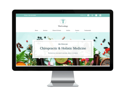
Homepage
The navigational structure was changed to better suit the business offerings. It was also very important to alert new users of the types of services Thriveology offered. A short list of services with a brief description was placed in a prominent area.
Here, you can see Thriveology before and after the redesign. Each number corresponds to a brief explanation about it below.
Before Redesign
1.) Redundant Navigation, 2.) Navigational Hierarchy not user-focused, 3.) Content does not engage users or help identify business offerings, 4.) Misleading language, indicates website functions not present, 5.) Critical content important to users not prominently presented
After Redesign
1) Second navigation changed to promote social media presence only, 2.) Navigation changed to better suit user needs, 3.) Hero image and blurb changed to something visually engaging that explains business offerings, 4.) Brief explanation and visual of main services given to users higher on the page, 5.) Giving users an idea of the family business aspect

Services
The original services page had a long list with no description of the services and no way to schedule them. I added brief descriptions of each service as well as a button for scheduling if users are interested in a service.

Before Redesign
1.) Redundant placement of contact info, 2.) Bad cue as well as misleading information about scheduling, 3.) Inappropriate placement of sign up ad, 4.) Long list of services with no explanation as to what the services are, 5.) Inappropriate placement of map that is not functional

After Redesign
1.) Users given a brief description of services, 2.) Users given a brief description of each service as well as an option to expand or eliminate content (progressive disclosure), 3.) Users given the option to schedule for services
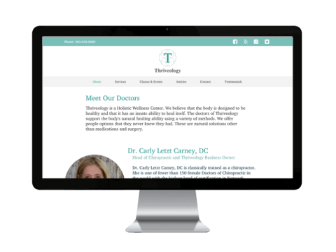
Meet the Doctors
The original page lacked brief bios of the doctors. Here, bios were added along with a more uniform look to each of the pages. Because the providers have articles and discussions they have been a part of, a button to learn more about them was added.

Before Redesign
1.) Images not consistent sizes, names on photos lead to lessened visibility of titles, 2.) Bios are not given about providers, making users have to dig for important information, 3.) One provider does not work for the company directly, this can be confusing for users

After Redesign
1.) A brief description will be added to help users understand what kind of providers they are, 2.) Images were made more uniformly and each provider was given a brief bio for users to see upfront, 3.) Button was added to allow users to see more information (blogs, articles, etc) from the providers

Classes & Events
There was no events section in the original site for events. But the business has enough events throughout the year that it seemed like a good idea to put in a page for this to alert clients of what they could attend.

About Page
Only the format of this page was changed to ensure that the business owners were featured more prominently and giving the page a more symmetrical feel.

Contact Page
Contact information was all over the original site, but not in a lot of the places users would come to expect or find easily. It was more straightforward to create a contact page that had all the pertinent information in one place. A form for questions and comments was also added to lessen administrative phone calls.

Before Redesign
1.) Redundant Contact Information, difficult to scan due to content structure, the only way to contact is by phone or email 2.) Same contact info used again when it is listed to the side, 3.) Cannot see the map and the map is not functional with Google Maps

After Redesign
1.) Made content easier to read, making information easier to process, 2.) Put a picture of a map instead of connecting with google so users would be able to have a constant visual, 3.) Added a form for users to fill out if they have any questions or concerns

Online Appointment Booking
Online scheduling is currently not available online at Thriveology. Adding a way for users to schedule appointments would not only make it easier for them, it also would take off a tremendous load from the administrative team and make their process more streamline.

Network Spinal Analysis Page
Because Network Spinal Analysis is so unheard of, it is very important to educate users on what this particular service is all about. A page was added in order to inform users of this service in more detail.
Next Steps
Unfortunately, due to the Covid-19 Pandemic, Thriveology closed their doors. The owners have since downsized their business and restructured their offerings. Even though the website did not become a live site, this was still a great early experience into optimizing an existing website.