

Spectrum: A Recap
UX Design

Overview
My Role: UX Designer, Visual Designer, Strategist
Tools: Sketch, Figma, InVision, Adobe Photoshop, Abstract, Zeplin
Timeline: Oct. 2020 - Present
Background
Since late 2020, I began my time at Charter Communications, parent company of national telecom provider Spectrum, provides internet, TV and Mobile services to millions of customers across the US. Spectrum has multiple platforms, including multiple websites and applications for both personal and business use. The initiative to bring customers more transparency, ease of use, and more ways to manage their services was our top priority as a product team. Throughout my time at the company, I have worked on a plethora of different projects, some of which I will briefly show here.

My Role
During my time here, my role has shifted at times through the 3.5 years as an employee. But my primary role has been working with the My Spectrum App (MSA), an app used by millions of users. I spent much of my time working on both Billing and Change Services (or Buy Flow, as we call it now). A great majority of users turn to MSA it for financial services (like paying their bill) and maintenance of current TV, Internet and Mobile Services. I have worked closely with the product owners, the product team on web counterparts, as well as the other app designers in order to stay in parity. I also maintained a close working relationship with the UX research team, Content team and the Accessibility team at all times to make sure all designs were data driven, simple and uncomplicated. Let’s take a trip down memory lane.
Billing Flows
Billing services are the most used function on the app, with a large percentage of customers coming to use the app for ease of bill paying. For this reason, it was very important for us to keep this function as simple as possible. There was already a good amount of functionality in this part of the app, and many of the projects we did for billing were smaller enhancements of the existing experience.

The Compare Statements flow for iOS
Billing Final Designs
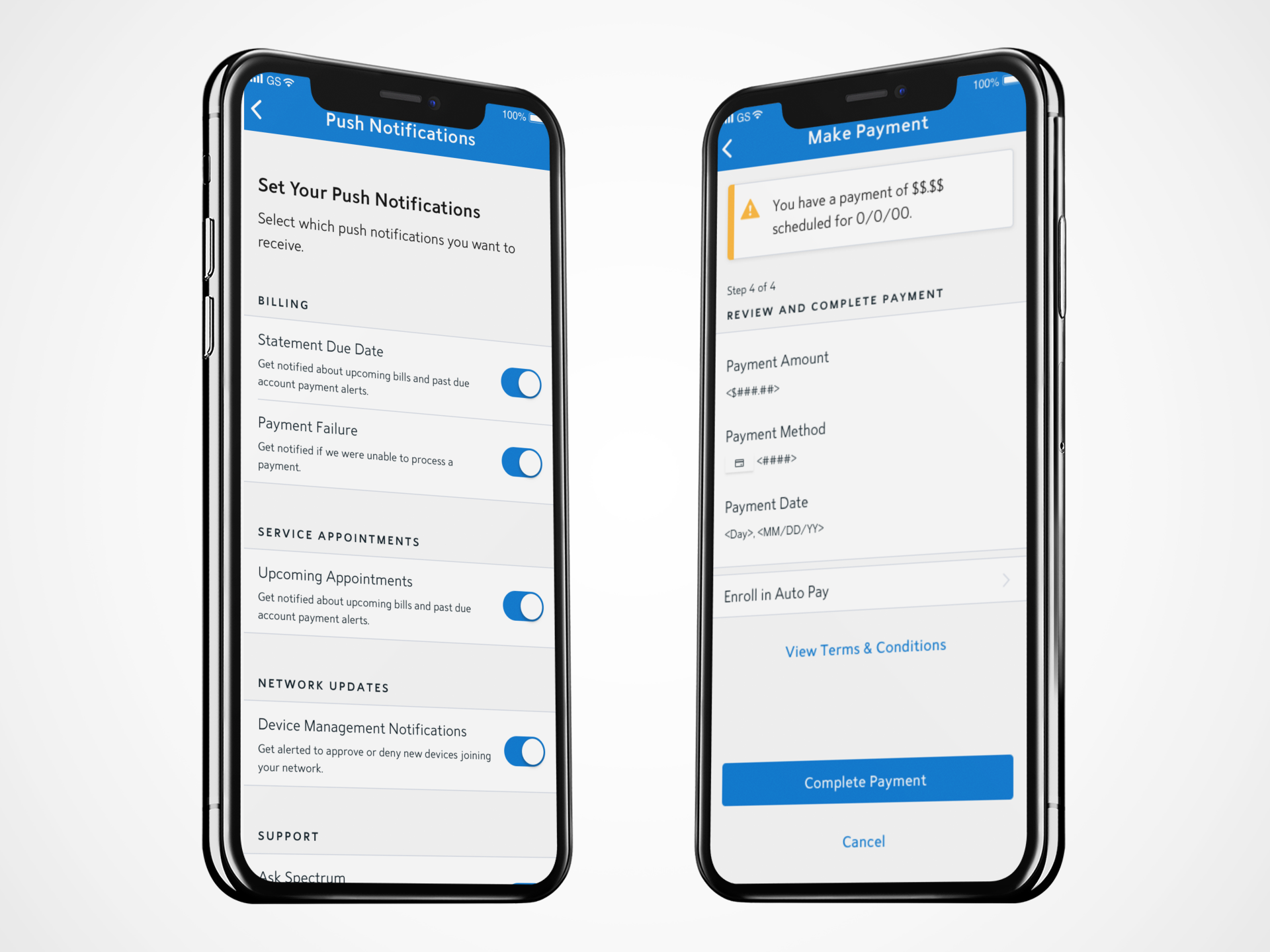
Notifications
We wanted to give user more control over their experience in the app. Giving customizable push notifications and global screen alerts were added to ensure greater communication of errors, informational pieces and successes.

Compare Statements
Customers desired a way to be able to see how much their bill had changed from month to month. We wanted to give users transparency into this aspect by adding deltas to show changes as well as a way to compare monthly statements side by side.

Unified E-Wallet
Spectrum core services and mobile services are separate, but it was important to create a unified billing experience for users that would allow them to pay for both in the same instance.
Billing Web vs. App Experiences
I collaborated with the UX designer on the spectrum.net platform often during each of our projects to remain in parity by using similar content, structure and UI. This presented a challenge on the small form factor device, but we always found a way to highlight the most pertinent information without overwhelming the screen or the user.

Change Service Flows
Change services has become a big feature in the app, and will continue to grow larger in the coming year with many new features being released. This section of the app, although similar in UI, was vastly different from billing. Change service has a lot more information and offerings, and we had to temper the large amount of content with keeping the functionality to the basics. Because the app is a smaller device, we found it crucial to create an experience that did not overwhelm the customer with features but still gave them all the same functionality as its web counterpart.

Flow for Add Channels

Flow for Add Equipment (WiFi Pods)
Change Service Final Designs

TV/Internet Upgrades
Giving users the ability to upgrade their own services at will without having to call Spectrum was an important feature. In our MVP for TV and for Internet, we gave customers select options to choose from to better their core service experience.

Channel Add Ons
Customers wanted a way to be able to add more channels to their base plan. Following closely with the UI patterns in the web application, we created our mobile version of the channel selection that users found to be very easy to use.

Equipment Add Ons
Like Channel Add Ons, there was a desire from customers to be able to easily upgrade their old equipment. With the plans to add an entire section for equipment, we have started to create these single add ons for MVP.

Plan Details
The existing plan details screen was getting to be content heavy, overly cluttered and long. We decided to mitigate this by adding tabs at the top to separate some of the information in a more digestible way.
Shop Tab
A large project for the coming year is the Shop Tab, which will replace one of the existing tabs. The Shop Tab will be the place where users can upgrade, add, and buy new additions to their core services. We wanted to make this a very easy, elegant solution that enticed users and gave them a great purchasing experience. These are some very early work in progress flows.

Plan Details Navigation Tabs Flow

TV Tab Flow
Change Service Web vs. App
I collaborated with the UX designer on the spectrum.net platform often during each of our projects to remain in parity by using similar content, structure and UI. This presented a challenge on the small form factor device, but we always found a way to highlight the most pertinent information without overwhelming the screen or the user.

Validation
Our team took many steps to ensure that the designs we released were rigorously tested, data driven and followed mobile accessibility standards. Charter is lucky to have fantastic teams that supported us in these areas, such as the UX research team, content, marketing and accessibility. With support from these teams, we all worked together to create what you see in the application today.
Next Steps
Recently, our team was tasked to primarily focus on Change Service. There are many plans coming for 2022 that we have begun to plan and scope for the following year. Shop tab will be one of those projects, and it will be a large undertaking with many features that come along with it such as more upgrading and adding options, as well as ways to help customers customize their TV service plans.